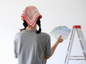
That tiny swatch may be misleading.
Picking the shade that will cover a room can be a daunting task — just where do you begin when staring at wall of dozens of shades? To help you approach the paint aisle with confidence, we asked interior designers to share the biggest missteps they see DIY decorators make most often.
1. You choose a hue by only looking at the paint chip.
"Teeny tiny swatches can be misleading," says interior designer Kaylan Kane. "I always recommend painting a relatively large area in the room before committing to a color."
2. You don't consider how the color changes over the course of the day.
Paint stores (notoriously lit with fluorescent bulbs) might try to provide examples of what the shade will look like in different lights, but you need to take it home to truly see what works in your space.
"Look at the color in the morning, throughout the day, and at night," says Kaylan. "Light can change so much in 12 hours!"
Interior designer Caitlin Wilson agrees: "It's always best to test paint on the walls and live with it for a few weeks," she says. "Paint a big sheet of paper or foam core and move it around the room at different times during the day."
3. You don't have a plan for the rest of the room.
If you're redecorating a space from scratch, it's helpful to have a vision in mind from the get-go.
"The biggest mistake I see is when someone chooses a wall color prior to selecting any furnishings," says interior designer Jennifer Schmidt. "What if you fall in love with a cool navy blue sofa, but its overwhelmed by walls you've already painted red?"
It's important to remember that you have nearly every paint color in the rainbow at your disposal, but are often more limited when it comes to furnishings and fabrics.
"You might be sure you want gray walls, but in reality there are a million different hues of gray." says Caitlin. "My philosophy is to work backwards by choosing the fabrics and materials first, so you can match the paint to the pillows, upholstery, and furniture."
4. You go too bright.
We're all for going bold on your walls, but you shouldn't necessarily choose a super-intense color to make an impact.
"Often, people go too concentrated," says Caitlin. "If you want a bright color, I suggest looking for a dustier shade rather than doctoring a bright hue with more white. Four walls painted in a bright hue will reflect each other, so it intensifies the look."
5. You think every beige is created equal.
"If you choose a neutral color, lightening it by 25% almost always gives it a bit more sophistication," says Caitlin.
6. You don't break the "rules."
"Everyone has heard that you shouldn't paint a small space a dark color," says Kaylan. "But this combination can create quite a cozy room."
Jennifer likes painting tiny spaces in deep hues, too: "In a small space, a dark color actually makes the corners recede," she says. "Once, I painted a powder room a dark charcoal, and it was really inviting."
7. You live with a color you don't love.
Sure, it's a pain to repaint a room when the shade doesn't quite work, but it's actually one of the cheapest and easiest design blunders to correct. (Think about it: You can't say the same about ill-advised wallpaper or tile work.)
"People are often disappointed when the color comes out lighter on the walls than what was reflected on the paint chip," says Jennifer. "Painting over it with the next shade deeper generally does the trick."